
John Lewis - Gunther Schuller jazz poster - Modern Jazz Society - Town Hall - 1955
John Lewis - Gunther Schuller jazz poster - Modern Jazz Society - Town Hall - 1955
- IN STOCK
- READY TO FRAME
- FREE U.S. SHIPPING
Couldn't load pickup availability
SecondTakeJazzArt presents...
a high-quality unframed poster featuring original artwork commemorating some celebrated live performances from jazz history:
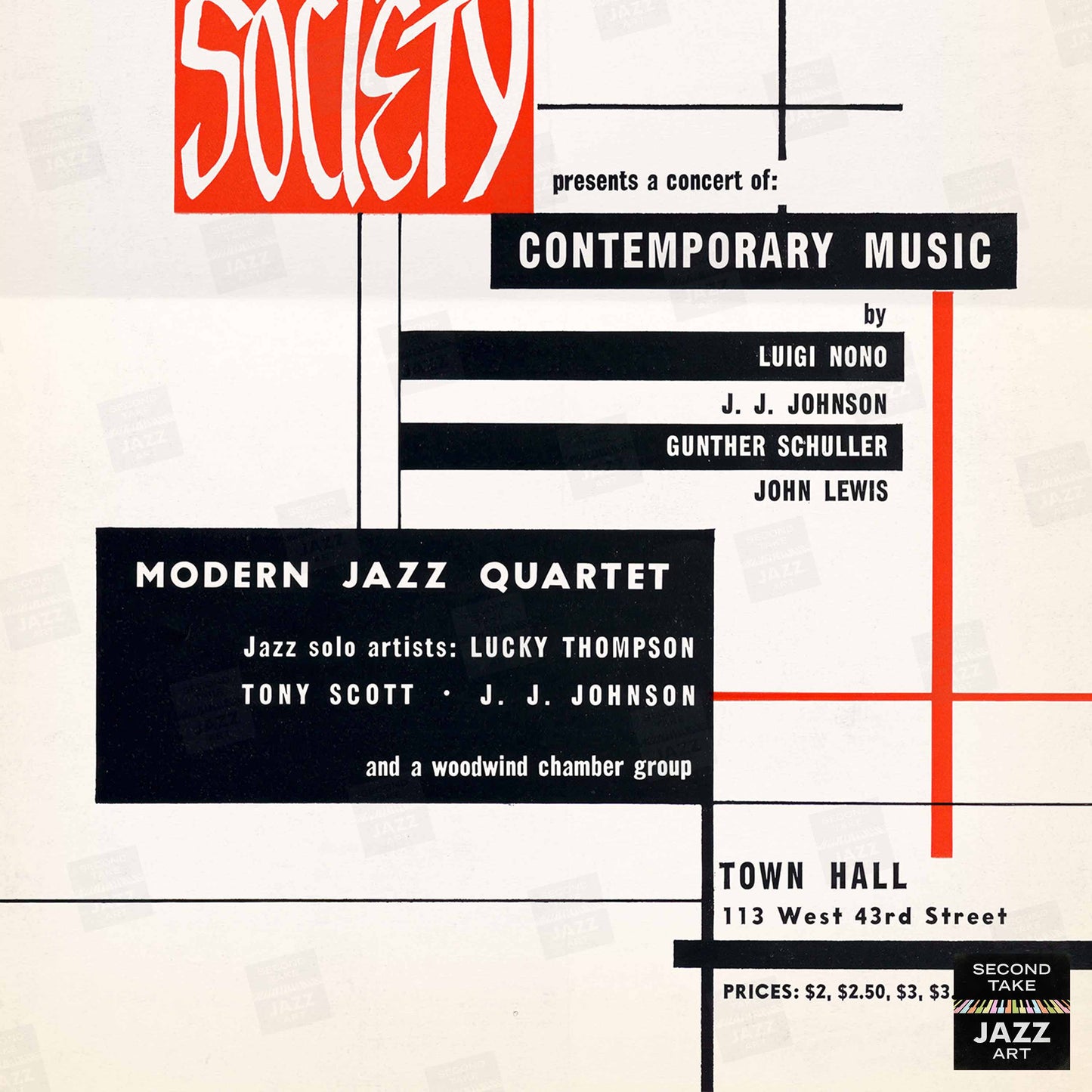
"Modern Jazz Society presents a
Concert of Contemporary Music"
the November 19, 1955, concert at Town Hall in New York City
with so-called "Third Stream" compositions by:
John Lewis ("Prelude: Sketch 1, Ballad, Blues," "Concorde," "Fontessa," "Porte de Versailles," "Django," "Sundance," "Midsummer," "Little David's Fugue," "Queen's Fancy")
Gunther Schuller ("Twelve by Eleven")
J.J. Johnson ("Turnpike")
Luigi Nono ("Polifonica, Monodia, Ritmica")
featured jazz performers:
The Modern Jazz Quartet
with John Lewis (piano), Milt Jackson (vibes), Percy Heath (bass), and Connie Kay (drums)
Lucky Thompson (tenor sax)
Tony Scott (clarinet)
J.J. Johnson (trombone)
together with classical performers:
James Politis (flute), Loren Glickman (bassoon), Gunther Schuller (French horn, conductor), Janet Putman (harp)
Taking its inspiration from George Gershwin's "Rhapsody in Blue" and progressive jazz composers and arrangers (like Duke Ellington, Billy Strayhorn, Gil Evans, John Lewis, Gerry Mulligan, Bob Graettinger, Pete Rugolo, George Handy, Ralph Burns, Alec Wilder, Eddie Sauter, etc.), the musical genre that Gunther Schuller called "Third Stream" truly had its heyday in the 1950s and 1960s. And one of the most historic early concerts dedicated to this music was the 1955 "Concert of Contemporary Music" by the Modern Jazz Society at Town Hall!
Exponents of this movement sought to create a brand-new style of composition and performance that forged its own path "halfway between" the worlds of traditional jazz and classical music. Their complex pieces typically combined some or all of the following: a) unusual mixed "jazz + classical" instrumentation; b) "modern" compositional techniques like atonality, serialism, etc.; c) passages of improvisation; d) references to swing and/or other dance rhythms; and e) extensive use of percussion.
The resulting chamber and orchestral pieces weren't always the most crowd-pleasing, and the more heavy-handed exponents of this genre never really caught on with either mainstream jazz musicians or the classical music establishment. Critics sometimes characterized the music as pretentious or soulless ("too much head, not enough heart"), but it was tremendously influential, permeating countless arrangements and scores during the Atomic Age/Exotica/Space Age Pop era and beyond (see Leonard Bernstein, Lalo Schifrin, Elmer Bernstein, Jerry Goldsmith, Ennio Morricone, Krzysztof Komeda, Henry Mancini, Quincy Jones, Oliver Nelson, Raymond Scott, Les Baxter, Martin Denny, Esquivel, Enoch Light, and many others). And in the jazz world, Gil Evans' albums with Miles Davis ("Miles Ahead," "Sketches of Spain," "Porgy and Bess,"); Eddie Sauter's "Focus" album with Stan Getz; and Bill Russo's writing for Stan Kenton are just a few "Third Stream"-adjacent examples whose popularity has endured.
https://en.wikipedia.org/wiki/Third_stream
https://en.wikipedia.org/wiki/The_Modern_Jazz_Society_Presents_a_Concert_of_Contemporary_Music
IMPORTANT INFO
IMPORTANT INFO
1) Our posters are new. First and foremost, all our posters are MODERN CREATIONS — they are NOT vintage pieces or antiques! Our posters are printed on-demand from our own ORIGINAL art files that we've created ourselves within the last few years. (Read on for more details.)
2) Bring your own frames. We offer our posters UNFRAMED ONLY! Many of our preview images demonstrate how our posters look framed in various real-world environments; however, these images are for ILLUSTRATIVE PURPOSES ONLY — we do NOT include frames when you order our posters! Offering our posters UNFRAMED ONLY helps us keep our production and shipping prices lower, allows us to offer FREE U.S. shipping on our posters, and lets our customers choose their own frame styles and materials to best match their taste, décor, and budget. (Thousands of inexpensive, easy-to-use framing options are available: with most, you just undo the clips on the back, slide in the poster, and redo the clips.)
3) Keep your cool. If you do wish to frame or mount our posters, do NOT use dry mount or heat press processes on them — doing so may DAMAGE them! Our posters are special digital prints that are prepared using vivid inks and finishes that can make them HEAT-SENSITIVE. (Instead, we recommend applying archival double-sided adhesive film; light misting with a pressure-sensitive archival spray adhesive such as Scotch/3M Spray Mount or Super 77; judicious application of archival double-sided tape; or mounting to peel-and-stick foam core/mounting board.) It's worth noting, however, that most folks who frame our posters skip adhesives altogether — they typically buy the right-size "ready to hang" frame for their poster and simply insert it freely into the frame. No muss, no fuss. Works like a charm!
4) Screens aren't paper. Please note that digital images are typically MORE VIBRANT than printed posters. Also, due to printing variations and editorial decisions, you can expect that the colors, details, etc. in the actual posters you receive may vary somewhat from their representations here. (Some preview images we show have been WATERMARKED for security purposes. Don't worry — these marks do NOT appear on the finished product.)
5) Perfectly imperfect. In general, our posters look what we like to call "PERFECTLY IMPERFECT." The events they publicize occurred in the distant past, and therefore the original source materials from which they derive often include not-so-minor COSMETIC FLAWS — folds, creases, scratches, spots, marks, smears, ghosting, discolorations, printing glitches, etc. In addition, some of the primary vintage advertising pieces contain TYPESETTING ERRORS — mistakes, typos, misspellings, etc. We elect to leave almost all of these issues INTACT. This serves to reflect the rushed nature of publicizing live jazz (with its often hurried programming and last-minute personnel changes), and when names are misspelled, these goofs reveal how some of the now-famous participants were still relatively early in their careers and not yet widely known. We always aim to strike a balance when preparing these "antique" materials for modern printing — holding onto their nostalgic, vintage-looking charm as much as possible — "warts and all" — while fixing issues primarily when they significantly hinder legibility. (Please be sure to ZOOM IN on our preview images to examine each poster closely. If possible, we recommend viewing on a desktop vs. mobile.)
6) A best-in-class experience. Our thousands of satisfied customers agree: posters from SecondTakeJazzArt are an outstanding value! To print our superior-quality posters, we use state-of-the-art digital presses, special vivid inks and finishes, and premium paper stock (typically matte satin 80# cover stock [220 GSM] or 45# bond [170 GSM]). And we pride ourselves on providing truly exceptional customer service. (For your reference, our customer feedback is overwhelmingly positive, and our return rate usually hovers around 0.5% — just 5 units returned out of every 1,000 ordered — and most of those are exchanges!)
And where do these posters come from?
Our mission at SecondTakeJazzArt is to produce high-quality visuals that commemorate celebrated live performances by jazz legends from the distant past. We particularly focus on renowned club or concert appearances that have been preserved by fan-favorite recordings — legendary shows for which little to no advertising ephemera survives (or was ever created.
SecondTakeJazzArt strives to fill in these gaps with carefully researched, highly detailed facsimiles of said missing ephemera. Our poster designs combine the verifiable performance information with vintage source materials (imagery, branding, type, etc.) and original elements (derived from or inspired by contemporaneous advertisements of the same/similar events in posters, handbills, newspapers, magazines, festival programs, album covers, etc.).
In general, the posters we've created for SecondTakeJazzArt fall into three categories:
1) some are our own wholly new original designs; (aka, "recreations" — new posters that we've designed ourselves to commemorate specific gigs or concerts);
2) others are our own original enhanced designs (aka, "refittings" — new versions of vintage poster designs that we've significantly edited, adjusted, reconfigured, customized, etc. ourselves to commemorate specific gigs or concerts); and
3) some are our own original upgraded designs (aka, "reprints" — new straight reproductions of vintage posters that we've painstakingly retouched ourselves).
SecondTakeJazzArt produces decorative tributes that aim to delight the viewer, not forgeries or fakes that aim to deceive them. Our goals are to either faithfully recreate and/or authentically mimic something close to what might have been or reproduce in higher fidelity what's largely been lost.
We sincerely hope you do enjoy our posters, and find them to be worthy constituents of your home or office décor.
All posters designed and printed in the U.S.A.
Share