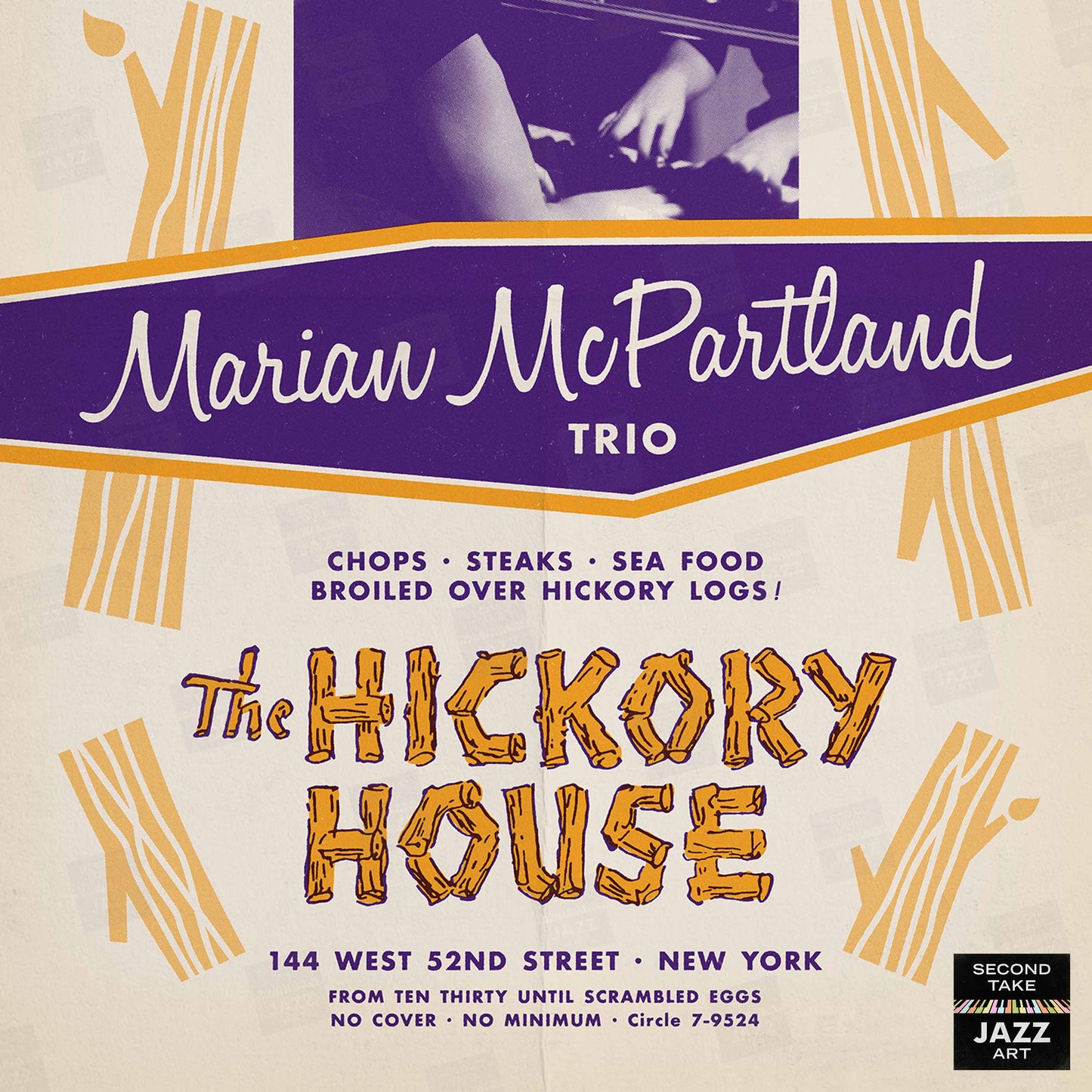


Marian McPartland jazz poster - At the Hickory House - 1954 (purple variant)
Marian McPartland jazz poster - At the Hickory House - 1954 (purple variant)
- IN STOCK
- READY TO FRAME
- FREE U.S. SHIPPING
Couldn't load pickup availability
SecondTakeJazzArt presents...
a high-quality unframed poster featuring original upgraded artwork commemorating some fan-favorite live performances from jazz history:
Marian McPartland
"At the Hickory House"
the 1954 nightclub residency at The Hickory House on 52nd Street in New York City
featuring:
Marian McPartland, piano
Bill Crow, bass
Joe Morello, drums
(occasionally augmented by cello & harp!)
One of the most important musicians, trailblazers, broadcasters, and educators in jazz, Marian McPartland was a true force. For over 30 years, radio audiences around the world tuned in to hear her "Piano Jazz," the pioneering interview-plus-jam-session show she created and hosted on syndicated radio. Her warmth, selflessness, skill, and passion for the music was apparent to every listener, and over the years, she played an important role in exposing the world to jazz and advocating for musicians.
But Marian's career really took off about 30 years before "Piano Jazz." In February 1952, she began a long tenure playing piano at The Hickory House, a midtown New York restaurant famous for its wood-fired meals and its oblong wraparound seating (with the musicians and bartenders in the middle!). And over the next year, a few personnel changes brought Bill Crow and Joe Morello into the fold, thereby coalescing the trio's sound and establishing a working band that would continue until Dave Brubeck hired Morello away in 1956!
The gentle sounds of Marian's modern piano approach at the Hickory House — light, graceful, and sophisticated, with sensitive support from Crow and Morello — might evoke other pianists of the era (at turns, her playing could remind one of Ahmad Jamal, Billy Taylor, Oscar Peterson, Billy Strayhorn, Dorothy Donegan, Hazel Scott, Lennie Tristano, Don Shirley, Mary Lou Williams, George Shearing, Teddy Wilson, Bill Evans, and others). But despite this somewhat chameleonic quality, she was truly a brilliant pianist all her own, with an original musical voice and a commanding touch that combined virtuosic runs, surprising harmonizations, complex voicings, and driving swing. The recordings of the Hickory House trio prove what listeners would come to recognize later over the 30 years of "Piano Jazz" shows — Marian McPartland could really play!
Meticulously derived from contemporaneous menus, handbills, and other ephemera for the Hickory House and other venues, this fun poster — featuring the famous Hickory House logo, a classic portrait of Marian, cute log illustrations, and the iconic "From Ten Thirty Until Scrambled Eggs" line! — has been a frequent request by our customers and comes in three color variants to match your décor.
https://en.wikipedia.org/wiki/Marian_McPartland
https://en.wikipedia.org/wiki/Marian_McPartland_at_the_Hickory_House
https://en.wikipedia.org/wiki/Piano_Jazz
IMPORTANT INFO
IMPORTANT INFO
1) Our posters are new. First and foremost, all our posters are MODERN CREATIONS — they are NOT vintage pieces or antiques! Our posters are printed on-demand from our own ORIGINAL art files that we've created ourselves within the last few years. (Read on for more details.)
2) Bring your own frames. We offer our posters UNFRAMED ONLY! Many of our preview images demonstrate how our posters look framed in various real-world environments; however, these images are for ILLUSTRATIVE PURPOSES ONLY — we do NOT include frames when you order our posters! Offering our posters UNFRAMED ONLY helps us keep our production and shipping prices lower, allows us to offer FREE U.S. shipping on our posters, and lets our customers choose their own frame styles and materials to best match their taste, décor, and budget. (Thousands of inexpensive, easy-to-use framing options are available: with most, you just undo the clips on the back, slide in the poster, and redo the clips.)
3) Keep your cool. If you do wish to frame or mount our posters, do NOT use dry mount or heat press processes on them — doing so may DAMAGE them! Our posters are special digital prints that are prepared using vivid inks and finishes that can make them HEAT-SENSITIVE. (Instead, we recommend applying archival double-sided adhesive film; light misting with a pressure-sensitive archival spray adhesive such as Scotch/3M Spray Mount or Super 77; judicious application of archival double-sided tape; or mounting to peel-and-stick foam core/mounting board.) It's worth noting, however, that most folks who frame our posters skip adhesives altogether — they typically buy the right-size "ready to hang" frame for their poster and simply insert it freely into the frame. No muss, no fuss. Works like a charm!
4) Screens aren't paper. Please note that digital images are typically MORE VIBRANT than printed posters. Also, due to printing variations and editorial decisions, you can expect that the colors, details, etc. in the actual posters you receive may vary somewhat from their representations here. (Some preview images we show have been WATERMARKED for security purposes. Don't worry — these marks do NOT appear on the finished product.)
5) Perfectly imperfect. In general, our posters look what we like to call "PERFECTLY IMPERFECT." The events they publicize occurred in the distant past, and therefore the original source materials from which they derive often include not-so-minor COSMETIC FLAWS — folds, creases, scratches, spots, marks, smears, ghosting, discolorations, printing glitches, etc. In addition, some of the primary vintage advertising pieces contain TYPESETTING ERRORS — mistakes, typos, misspellings, etc. We elect to leave almost all of these issues INTACT. This serves to reflect the rushed nature of publicizing live jazz (with its often hurried programming and last-minute personnel changes), and when names are misspelled, these goofs reveal how some of the now-famous participants were still relatively early in their careers and not yet widely known. We always aim to strike a balance when preparing these "antique" materials for modern printing — holding onto their nostalgic, vintage-looking charm as much as possible — "warts and all" — while fixing issues primarily when they significantly hinder legibility. (Please be sure to ZOOM IN on our preview images to examine each poster closely. If possible, we recommend viewing on a desktop vs. mobile.)
6) A best-in-class experience. Our thousands of satisfied customers agree: posters from SecondTakeJazzArt are an outstanding value! To print our superior-quality posters, we use state-of-the-art digital presses, special vivid inks and finishes, and premium paper stock (typically matte satin 80# cover stock [220 GSM] or 45# bond [170 GSM]). And we pride ourselves on providing truly exceptional customer service. (For your reference, our customer feedback is overwhelmingly positive, and our return rate usually hovers around 0.5% — just 5 units returned out of every 1,000 ordered — and most of those are exchanges!)
And where do these posters come from?
Our mission at SecondTakeJazzArt is to produce high-quality visuals that commemorate celebrated live performances by jazz legends from the distant past. We particularly focus on renowned club or concert appearances that have been preserved by fan-favorite recordings — legendary shows for which little to no advertising ephemera survives (or was ever created.
SecondTakeJazzArt strives to fill in these gaps with carefully researched, highly detailed facsimiles of said missing ephemera. Our poster designs combine the verifiable performance information with vintage source materials (imagery, branding, type, etc.) and original elements (derived from or inspired by contemporaneous advertisements of the same/similar events in posters, handbills, newspapers, magazines, festival programs, album covers, etc.).
In general, the posters we've created for SecondTakeJazzArt fall into three categories:
1) Some are our own wholly new original designs; (aka, "recreations" — new posters that we've designed ourselves to commemorate specific gigs or concerts). Descriptions for these posters typically include the phrase "featuring original artwork."
2) Others are our own original enhanced designs (aka, "refittings" — new versions of vintage poster designs that we've edited, adjusted, reconfigured, customized, etc. ourselves to commemorate specific gigs or concerts). Descriptions for these posters typically include the phrase "featuring original enhanced artwork."
3) Some are our own original upgraded designs (aka, "reprints" — new straight reproductions of vintage posters that we've painstakingly retouched ourselves). Descriptions for these posters typically include the phrase "featuring original upgraded artwork."
SecondTakeJazzArt produces decorative tributes that aim to delight the viewer, not forgeries or fakes that aim to deceive them. Our goals are to either faithfully recreate and/or authentically mimic something close to what might have been or reproduce in higher fidelity what's largely been lost.
We sincerely hope you do enjoy our posters, and find them to be worthy constituents of your home or office décor.
All posters designed and printed in the U.S.A.
Share